This week is “Shakespeare Week” at my son’s school: his year have been allocated A Midsummer Night’s Dream, and so get to do their lessons in costume for a day. All of which yielded an ideal family opportunity to break out one of those tediously aspirational The-Bard-For-Kidz boxed sets and run through a heavily abridged version with him to see which character he’d like to play (i.e. which outfit we’d be rapidly constructing). And so Puck it was. 🙂
In business school terms, Oberon and Puck come across to me as an idealized (i.e. pragmatic yet dysfunctional) CEO and CTO pair, i.e. where Puck trolls around the wood trying to implement Oberon’s barking mad strategies. Specifically, Puck drops a tincture of “Love In Idleness” into the eyes of those asleep, confident in the knowledge that they will fall in love with the first person (or indeed donkey) they see when they wake up. With hilarious (and/or dramatic) consequences, etc.
Shakespeare is full of folksy herbal stuff like this: in fact, you don’t have to look very far these days to find academics who argue that the witches in Macbeth were talking about not literally about “eye of newt”, “toe of frog”, and “wool of bat”, but referentially to ‘eye’ plants (such as daisies!), buttercups, and holly leaves respectively, as a humorously winking aside to the audience. If correct, this pitches the witches closer to pantomime dames (such as Nana Knickerbocker, my son’s favourite) than to Cruella De Vil… but I digress!
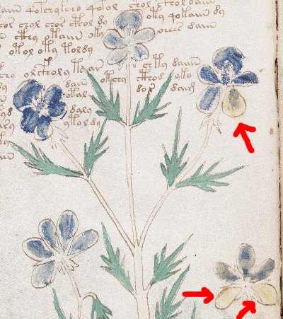
Anyway, it turns out that ‘Love In Idleness’ is actually viola tricolor, the purple wild pansy (from which modern pansies were cultivated in the 19th century), A.K.A. ‘heartsease’ and hundreds of other names. Which, of course, is the cue for a picture of the plant on Voynich Manuscript page f9v, for which numerous people have suggested viola tricolor as a good match:-
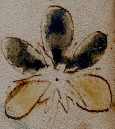
As normal, the unsympathetically-applied blue paint looks as though it was added by a later owner’s young child: yet what is strange here is why three of the leaves seems to have had yellow paint added instead (which is what my annoying red arrows are pointing at). If you contrast-enhance the bottom-right flower, you can see this quite clearly:-
Why was this so? I don’t know, but perhaps that’s not a bad question to be asking. Is that enough random digressions for one day? Probably! 🙂


Nick
I can see you have far better resolution pics than I do – top left flower in the bottom petal do you think that’s a ‘V’ for viola and that the ‘g’ that occurs on other pages is giallo – the 2 like one is an ‘R’ for rosso etc. has anyone worked them all out?
I can only get the 8x res. from the Beinecke
It’s funny you should mention that, Tony.
I have recently done exactly that, and it shows
that the Voynich MS author was German.
I am in the middle of writing it up.
Tony, Rene: I have no idea what you’re talking about. Note that at the highest resolution images, all kinds of subtle compression artefacting creep in (note that MrSID artefacts are different from JPEG artefacts) – every time I think I’ve seen some incredibly fine detail hidden in the pictures, I’ve been wrong. All the same (Rene), I look forward to seeing what you think you’ve found…
Nick
‘subtle compression artefacting’ – you certainly have a way with words! Can you give us a blow-up of the top left petals just as you’ve done with the bottom right – there’s a definite ‘v’ in there – just as a leaf on f.1v has a medieval ‘g’ in it – surely marks by the author to tell him what colour to put in later – others and the ‘a’ and ‘b’ on f.70r1 and f70.r2 allow us to build up a bit of the authors natural alphabet – assigning the colours to the letters – his native language.
I too look forward to Rene’s work (I’ve only just started to look at this aspect of it)
Gee – I’ve just discovered who it’s by – look at the top of the root on f.13v – it’s a Lowry
The evidence is rather strong. I’ve asked the opinion of a few people
and they all tended to agree. It requires the use of illustrations which
again I think cannot just be put on the web, but that can be fixed in
the near future.
If we go back to the web page of Philip Neal:
http://voynichcentral.com/users/philipneal/analogues/alchemical.html
one of the herbals mentioned there is:
Vicenza, Biblioteca Bertoliana MS G.23.2.3 (362)
s. 15, Italy and Germany
Actually, G.23.2.3 is the old shelf mark and now it is usually referred to as
MS 362. It’s a 15th century italian herbal, with illustrations from the
alchemical herbal tradition. It also says ‘Germany’
because Segre Rutz
in her book quoted by Philip describes that it has ‘colour annotations’
in German. Indeed, in the few illustrations I have from this herbal, you
can easily see many occurences of ‘rot’, ‘gr(ue)n’, ‘gelb’ (red, green,
blue) and also ‘erd’ (earth) or ‘weiss’.
Additionally it has one illustration with alternating red and green leaves, with
alternating single ‘r’ and ‘g’ characters written inside.
These all look extremely similar to the few colour markings in the early quires
of the Voynich MS. There’s a clear ‘rot’ in the root of f9v (already seen
by many), there’s the ‘g’ in f1v, and then there’s another ‘rot’ with some
individual ‘r’s under the paint of the viola tricolor mentioned above, and
another ‘g’ to the side of the flower on the right.
As this concerns marginalia, I sent a more complete summary to
Elmar Vogt, and hope that he will decide to include it in his latest
paper.
Here’s one image link to a page of Vicenza MS 362 with ‘rot’ in the root
(barely visible in this resolution):
http://images.art.com/images/products/large/12258000/12258044.jpg
and this one has the alternating ‘r’ and ‘g’ characters:
http://images.art.com/images/products/large/12258000/12258047.jpg
(same problem).
Excellent – MS 334 mentioned earlier had the ‘g’ in yellow paint ‘gallios’, a ‘v’ on green paint ‘verdi’, an ‘r’ on red paint ‘rosso’ – so that was by an Italian – the VM by a German –
vereee interesting.
Tony, have you seen the original or a facsimile?
Rene – the original – it’s one of several I’ve been looking at in the Wellcome library – just trying to get it all in perspective – the others I’ve looked at so far did’nt have any ‘colouring letters’ that I noticed
Note: discussion on hidden letters in plants continued in this post…
Returning to your original question of ‘why does it have 2 colours?’
In EPB/ 1983/B a 16th c. herbal with 300 excellently drawn and coloured illustrations and hardly any of the snakes, faces, weird roots etc.
On f.105 labelled – Iaceanigra – trinitas – freyssamkraut (the last is its German name though I may have misread the spelling) is a 5 petal flower with 2 petals purple, 2 yellow & 1 white
Trinitas – trinity – three – colours?
Interestingly, the Wellcome library has digital images of another herbal
on-line, namely WMS 336. It is listed as late 15th century and the plant
illustrations seem rather naturalistic, though some of them are more schematic.
On f32v there is an illustration of a sick person being reached a bowl of
something, which is called ‘polte de orzo’ presumed to mean barley broth.
There is a certain reminiscence of the ‘musmel’ interpretation of Voynich
MS f66r. Could the Voynichese writing there say: “polte de orzo”?
The illustration can be seen on this web page:
http://marinni.livejournal.com/343792.html
but it can also be found through the Wellcome image search page:
http://images.wellcome.ac.uk/
If trying to label the flower “viola” the scribe would have tried to also indicate the color “ue-o-ll-tius” . This is as close as he could come to another word for “p-r-p-ll”. Just my “take” on a puzzle which probably became “ad nauseum” long ago. (?)
Besides, purple pigment would have been the most expensive, being as the pigment would have been extracted from the shell of a marine animal. “Royal Purple”
? 🙂
If you begin by expecting the script will be German, the letters read ‘r.o.t’. But the fact that no part of v.tricolor is coloured red, nor yields a red dye is surely a little awkward, though once more pure imagination (as ‘hypothesis’) should be able to invent some circumstance in which a person might spell out the word ‘red’ across three petals of a flower coloured blue with or without some yellow in it.
Perhaps one could imagine the colourist meant to make a mixture of blue and red, but forgot the red, or ran out of that pigment, or was informed that in the society he found himself, colours in the purple-to-black range were tabu?
Or perhaps his German was novice-level and he momentarily forgot that ‘rot’ meant red, not blue and/or yellow?
Or he meant to write the English for ‘root’ and didn’t bother with the doubled ‘o’.
Or – if it were from Old English, it might refer to the plant’s being ‘heart’s ease’ – gladdening the heart, since
Old English rot = Middle English rote ‘glad’.
or we may be assuming too much in assuming so much about script, language, and conditions governing production.
Addendum: I’d like to X-file this discussion to Boenicke’s 408, in re folio 49v: John Tiltman was unable to translate the folio which had a quite well-drawn picture of a Turban Ranunculus. That picture was also misleadingly colored. What interested me (and immediately sent me to my botanical books) was the “R” formed in the center of the petals at the top of their stems. Line 7 of the first paragraph translates to ranun-quollr-ec-o-aes-an-aesox (ranunculus species).
I also noted the false coloring of the blossom — and the lack of leaves. In this new century, I’ve noticed that the US government has been posting DOCID items to the WWW.
Several of which are from Brigadier Tiltman’s archives (which are in black and white “photostat” prints).
Bdid1dr
This is not a rhetorical question: have you found any of your proposed descriptions rely on Linneus’ binomial system? If so, that would seem to put everyone out of the picture who has usually been associated with the ms’ history during the seventeenth century, wouldn’t it?
sorry to forget it –
Meant to add that folio 49v’s ‘potato’-like tuber isn’t drawn ‘weirdly’ but by reference to a convention in eastern botanical imagery: just one more of the many such in this section.
Two nice, if late, examples turn up on the one site if search terms used are ‘Bencao’ with ‘tuber’ – though I expect ‘Bencao and ‘bulbil’ will be just as good.
One of those illustrations shows other customs in drawing that inform the Vms botanical imagery, and the other shows that this way of drawing “yam-like” things isn’t limited to drawing the air-potato.
Far from rhetorical. I just keep the “acea” and “ceus” to a minimum when translating those tedious more-than-binomial terms. Something I missed, however, which seems to be used more with the aquatic plants, is the conclusion of a long string of those tri-nomial, quadrinomial…phrases is “itius” or “tius” — and also “deus” or “dios”. Here and there I have seen whole paragraphs of unecessary repetitions. I’ve learned to isolate the “key” words or phrases but I don’t necessarily capitalize the word “Dios” unless it is indicating a reference to “God”.
Several weeks ago I also referred to another of Tiltman’s efforts: The “Dianthus” family of Pinks, Sweet William, and Carnations. I’m guessing that post “went right by” you? Or did you choose to ignore a supposed jibe? Really, I couldn’t resist, even though there were other references to Caryophyllacae in that same (miscolored blue) Boenicke folio.
Respectfully yours,
beedee